Showing posts with label graphic design. Show all posts

Saturday, November 5, 2011

Nemo matte painting/book cover

Here's a bit of an experiment - part digital painting, part photo composite, kind of a book cover, kind of just a pretty picture. To the left is a closeup of the figure that would appear on the cover if it was a cover. I was imagining a Little Nemo in Slumberland-meets-Labyrinth tale about a young woman's adventure in a dream kingdom. Below is the full composition, vaguely planned as a hardcover dust jacket - the sun's on the spine, the two mountains are the flaps.
click images to enlarge

Friday, October 28, 2011

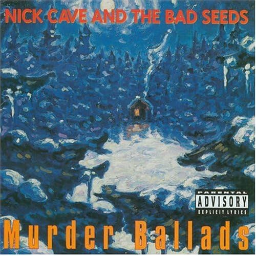
Nick Cave album designs


This is a project I really enjoyed - redesigning Nick Cave and the Bad Seeds' album Murder Ballads. It's a fine album but the album art (left) is fairly bizarre. Was Thomas Kinkaide involved? The album redesigns below date back to last autumn, when my now well-worn Intuos tablet was shiny and new. I tried out three different concepts - hit the jump to see two additional designs.


click images to enlarge

Friday, April 29, 2011

The Copper Pot

click image to enlarge

Here's a logo and menu design for a restaurant proposal that I really hope takes off, because the menu sounds more and more delicious the longer you stare at it and no one has stared at it longer than me. The Copper Pot would be part of the proposed Grand Rapids farmer's market/food Mecca (read more here) that other downtown residents and I are impatiently eagerly awaiting. At least the Fulton St Farmer's Market is opening soon, ending months of fevered dreams of Lubbers Farm's baked goods.

My boy Tim spearheaded the project, acting as menu composer and art director. Our friend Devon (Tim keeps it in the family) created interior and exterior renderings - the restaurant will have a quite cool '50s retro design that she captured beautifully. Below are both sides of the summer menu, click for sizes big enough to read and salivate over.

click to enlarge images

Friday, December 3, 2010

Classic Horror Playing Cards


click image to enlarge
Playing cards! Playing cards are a standard Illustration assignment for freshmen students, and mine were very much representative of my grade. I was excited to have another crack at the idea, this time as a fifth-year senior with a way better grasp of digital media. The theme was open, so I chose old-timey horror writers and their creations (Ambrose Bierce is the imaginary King of Diamonds.)

I really enjoyed designing and illustrating these, and really enjoyed having another opportunity to illustrate in my Graphic Design class this semester. Illustration and Graphic Design are a natural combination, and as my design skills develop, it's nice to design or draw circles around classmates on both sides of the fence, respectively. Foolish suckas! (Eagle vs Shark quote aside, plenty of my classmates are far better in their particular fields, and I am very grateful for their advice and assistance.) On to the rest of the cards!


click images to enlarge
A little aside about these: Photoshop actions are the best! The cards were designed for print, so they needed several changes to display properly online. I recorded a little action so they would all turn out the same, and IT WAS SO FAST AND EASY. I am thrilled. Photoshop actions: use em'.

Thursday, November 11, 2010

Stretching Diagram

click image to enlarge

Here's a helpful little chart of some very valuable exercises. I've been doing the Ryutai Undo, solo and with partners, for about seven years - you'd think I could put my feet behind my head by now, but like anything else you get a bit rusty when you take a week off. I usually try to do these daily, particularly when my workload is heavy (as it has been this last month!) - a healthy spine and hips are literally the foundation of my life.

Making this chart was an interesting exercise. I learned a lot more about drawing with vector, but also carefully considered my reasons for recording the Ryutai Undo in visual form. In the past I've been rather protective of this practice, and my asking someone to stretch with me is still a sign of great affection. Now the trend reverses - these exercises are so simple and so healthy that I want to share them! Ask me to stretch sometime, let's all have healthy hips.

Sunday, October 3, 2010

Zombies vs Librarians

Hello and welcome to Misha's new art blog, for those of you just making your way here. There are a few other posts below this one, featuring some of my graphic design work plus some nicer versions of images from the old blog. From here on, everything will be new! new! new!

Following below are images from a graphic design project completed a few weeks ago - promotional materials for a movie inspired by ordinary life. I tried a fun approach, drawing inspiration from a dream my coworker had about fending off a zombie attack at the library. I created a large poster, tear-off sticker sheets for guerrilla marketing, buttons and t-shirts, and an alternate poster. Plus, a good time was had by all.

click images to enlarge


Saturday, October 2, 2010

Graphic Design

When I started working on my Graphic Design minor, I knew basically nothing about design (which was a big part of my motivation.) These pieces are from my first two classes. Judge them kindly.

orson welles' sweet bowtieclick image to enlarge

Orson Welles, you fatty. I do like his typographic bowtie.

katana anatomyclick image to enlarge

I am immensely proud of this photo. It took a bit of post-processing, but my little point-and-shoot did the job. This was designed as a rather large poster, so not all the text is readable at this smaller size. I plan on redoing it because I am so fond of the photo and general idea.